Week 2 - Avatar, Button, and CSS art
March 9th, 2025
This week, we have done some important work on native Avatar and Button components. We also took a break from the usual and explored something a little different: bringing CSS art into our native apps!
Avatar
To bring a more personal touch to our UI, we introduced the Avatar component. It supports remote images and comes with different sizes to adapt seamlessly across layouts and screen sizes, whether it is placed in title bar or sidebar, ensuring a clean, consistent, and scalable appearance.
As common practice, our Avatar can fallback text rendering when no image is available. Users will see a clean, customizable text-based avatar, maintaining a consistent and polished UI across our apps. This feature can even be used to display customized messages.
In addition, our text Avatar component is designed with high contrast support, improving readability while preserving its aesthetic appeal in our native apps.
Button with hover and active states
Some small wins of this week include improvement for our Button component. We now added hover and active states, making interactions more intuitive and responsive. Instead of basic color changes, we focused on subtle depth shifts and shading, giving the buttons a tactile feel. Now, every press and hover is met with a polished, natural response.
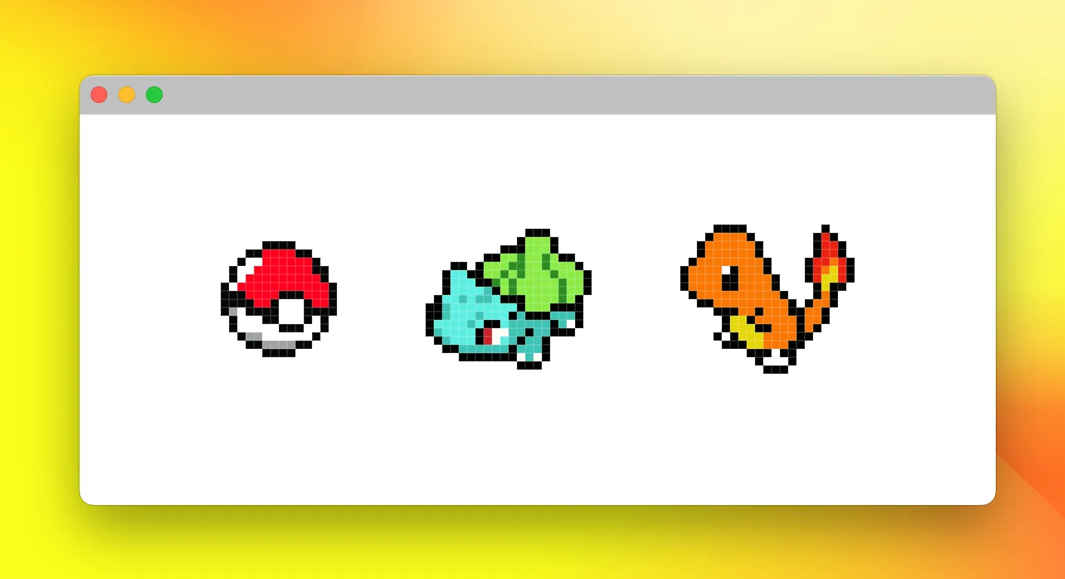
CSS art rendered in Metal
Yeah, that’s right! After the whole week working on native components, we had some fun with CSS art! We’ve created some nostalgic pixel art Pokémon sprites (inspired from NES.css) - a classic Poké Ball, Bulbasaur, and Charmander looking just like they did in the original games 30 years ago. Who needs fancy graphics when you can recreate that perfect pixel nostalgia?
From pixel art nostalgia to UI refinement, Week 2 has been a mix of fun and progress. Stay tuned as we continue pushing the boundaries of native app design at 120.dev!